


In Part 1 of this series of Getting started on a GIS Project, we looked at how to frame our question then explored and prepared some GIS data. In this part we will look at the next steps of the GIS Method which mainly involve spatial Analysis:
iii). Choose analysis methods and tools
iv). Perform the analysis
If you have not folllowed through the first two steps, you can look them up at Part 1 of this series.
Step 3. Choose analysis methods and tools
This will involve finding best tools and algorithms to help us map the population data.
So let me introduce some GIS jargons:
The art of making maps is called Cartography while a map that is made to show a specific phenomena or theme are called thematic maps and if we would use color to represent the theme we are mapping, like in our case, that map would be called a Choropleth Map.
However, when creating a Choropleth map one has to be careful because as Abdishakur in this post puts it:
One particular drawback of using choropleth maps is that areas are not uniform, and thus the displayed results might not portray the right results. For example, large geographic areas might dominate the visual.
Beware to normalize the attribute for the choropleth map. Otherwise, the visual map is misleading.
Normalization arises from the fact that choropleth maps are asking us to compare data for different areas but because these areas are almost always different in geographic size, we invariably end up comparing them on unequal terms.
To normalize, in a statistical sense, is to transform a set of measurements so that they may be compared in a meaningful way. Technically, normalization involves factoring out the size of the domain where you wish to compare counts collected.
Therefore for our case, before we map the population we need to first normalize it. This will be by calculating the population density which is population divided by the area per county.
So that in the end we could have the number of people per square kilometer for each county. With this, it is possible to compare how the population varies from one county to another.
With this now we can go to the next step of the GIS Method
Step 4. Perform the analysis
From what we have found out so far, these are the steps we will follow so as to perform the analysis:
a. Re-project the data
b. Compute the area
c. Compute population density
d. Style the data
a. Re-project the data
This will be done in order to be able to carry out computations in the dataset.
From the the information panel we viewed, we found that the projection, that is the CRS (Coordinate Reference Frame) is WGS 84, which stands for World Geographic Coordinate System whose units are degrees, therefore we will need to convert this projection to a projected coordinate system whose units are meters.
Geographic coordinate systems are based on a spheroid and utilize angular units (degrees). Projected coordinate systems are based on a plane (the spheroid projected onto a 2D surface) and utilize linear units (feet, meters, etc.).
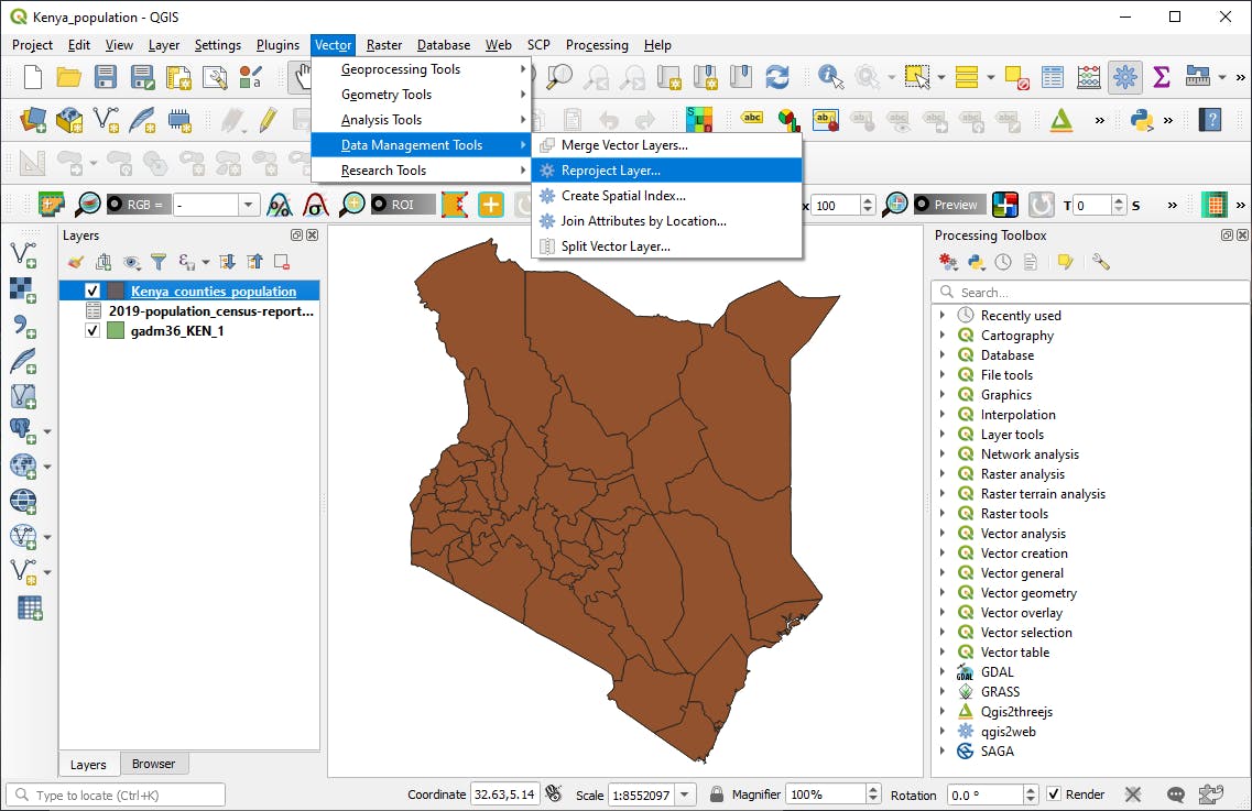
To reproject the Kenya_counties_population layer, in the menu bar go to Vector -> Data Management Tools -> Reproject Layer:
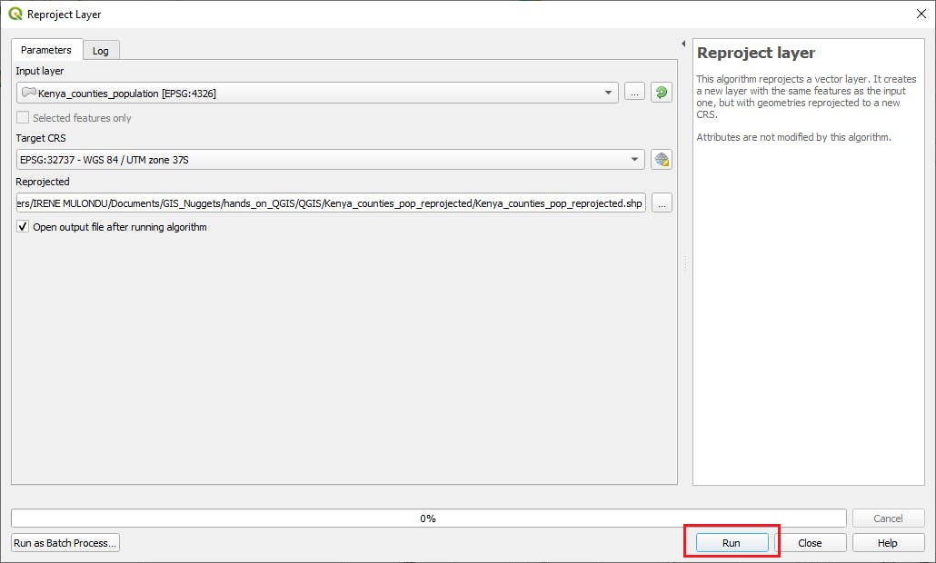
In the window that comes up fill up the sections as follows:
- Input layer as the Kenya_counties_population dataset
- Target CRS as EPSG:32737 - WGS 84 / UTM zone 37S
- Reprojected: Navigate to where you want to save the file and save it as Kenya_counties_pop_reprojected.shp
- Then click the run button at the bottom
b. Compute the area
Now we will compute the area for each shapefile and add this as an attribute field.
So right click the Kenya_counties_pop_reprojected layer in the layers panel then click on Open Attribute table to open the attribute table of the dataset.
In the attribute table that opens up, click the editing tool, marked (a), to enable editing then click the open field calculator tool, marked (b) as shown below.
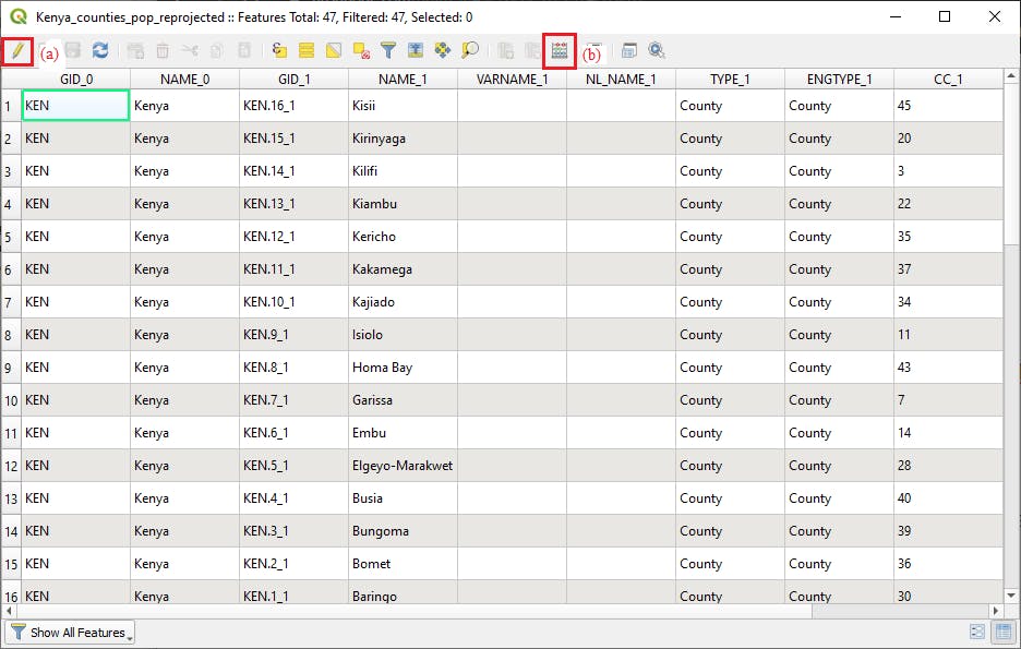
The field calculator widow opens up
In the field calculator window, make sure:
- The Create a new field option is checked.
- In the Output field name put Area
- Output field type should be Decimal Number (real)
- The Output field length put 20 and the precision to be 3.
- Then in the middle window, under geometry section, double click on $area
- Then click OK button.
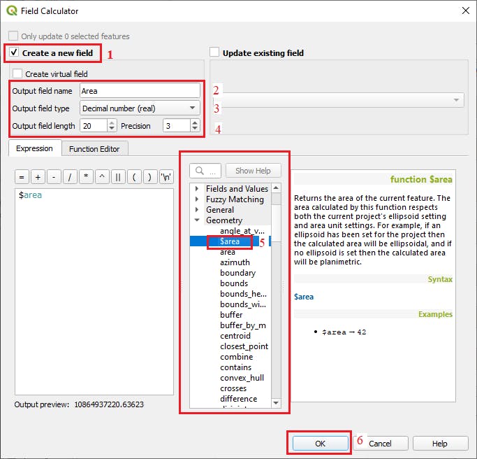
The area for each county feature will be computed then added as a field in the attribute table.
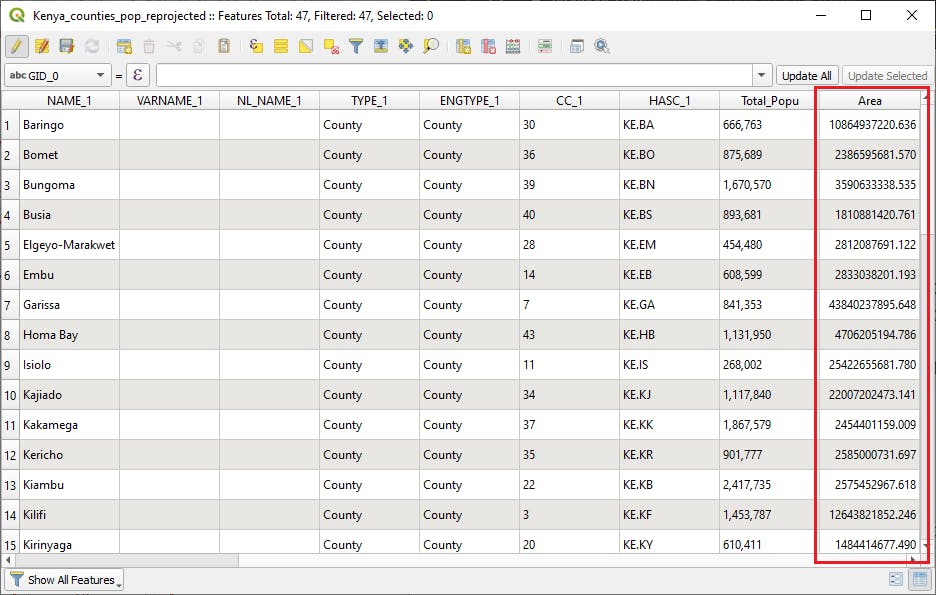
Since the projection units of the dataset is in meters, therefore the area will be in square meter.
c. Compute Population Density
Population density is the number of people per unit of area, usually quoted per square kilometer or square mile. Population density is calculated as follows:
population density = total population/ area
In the attribute table you will notice the Total population column has values of string type.
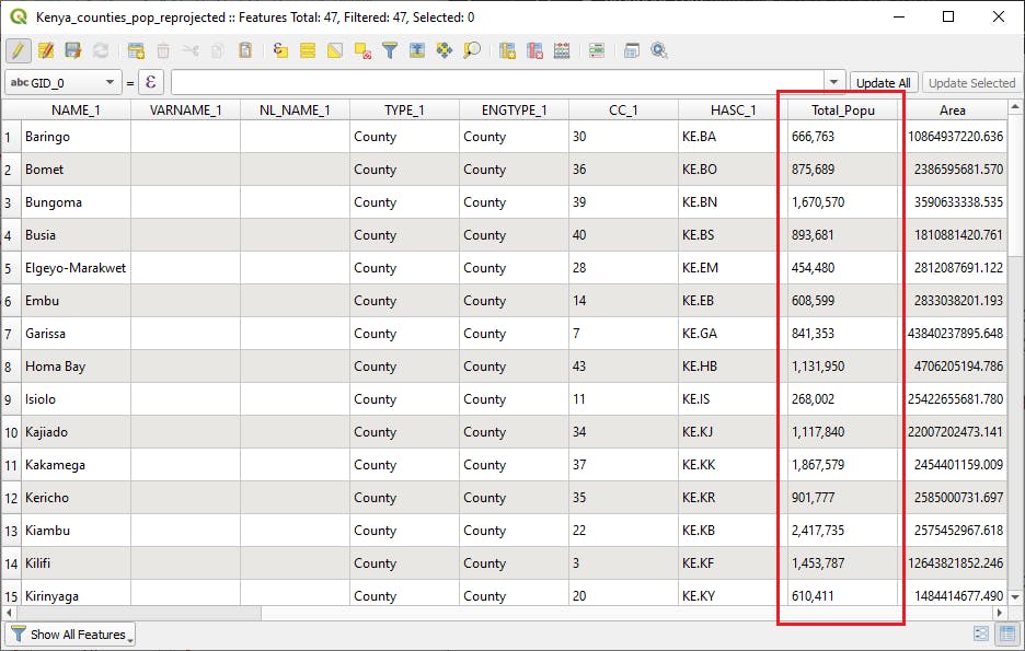
So we will first convert the population to integer using the the Field Calculator tool:
- Open the Field calculator tool as we did before.
- Fill up the sections as shown below:
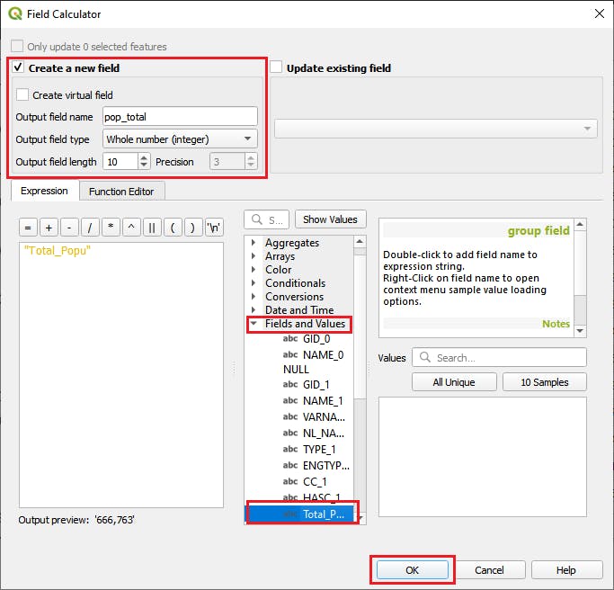
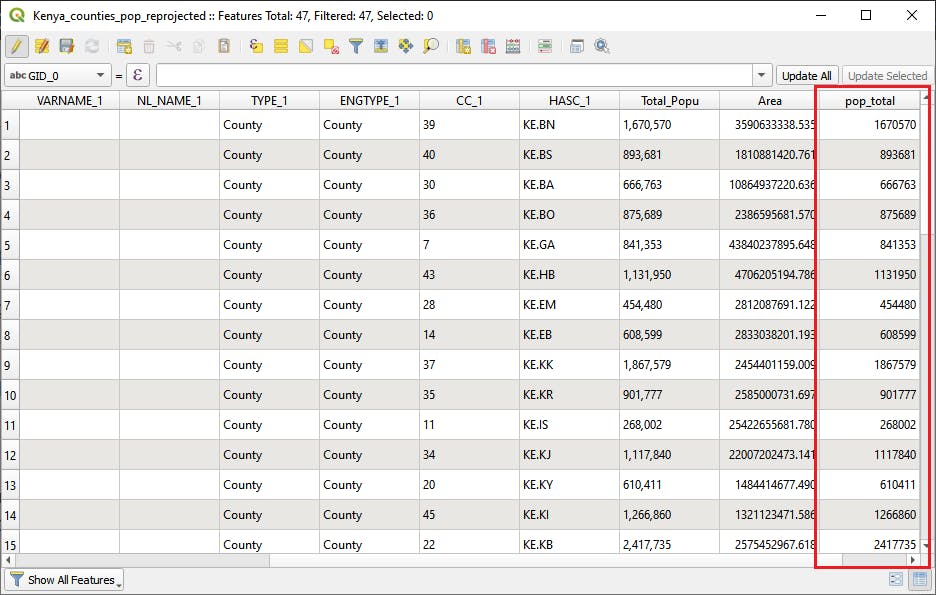
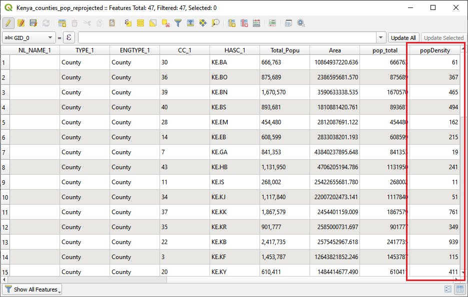
This will return an added pop_total column in the attribute table
To calculate the population density, we will also use the Field Calculator tool. So open it, then define the entries as shown below:
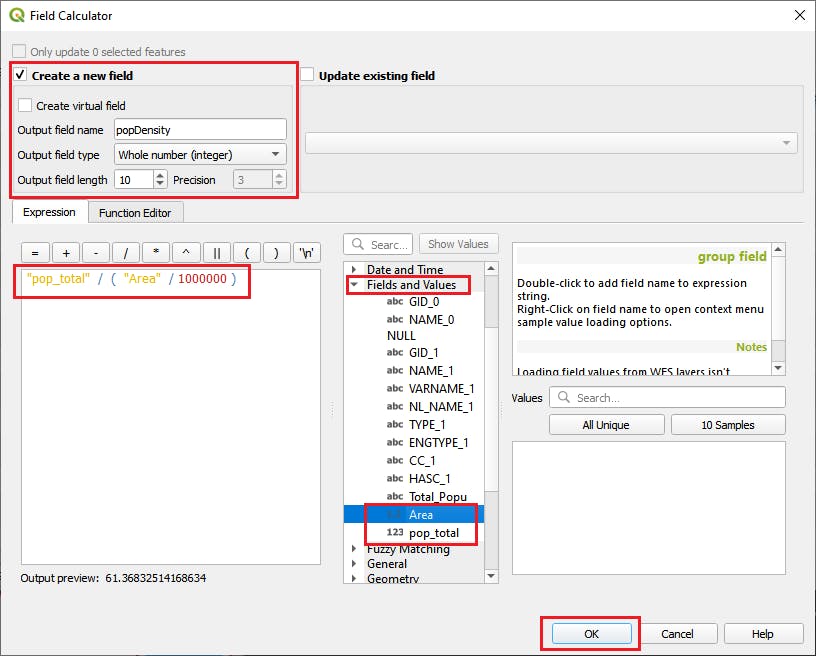
We have divided the Area by 1,000,000 because the area is in square meter but we need to use area per square kilometer so that the population density becomes number of people per square kilometer.
This will return the attribute table as shown below:
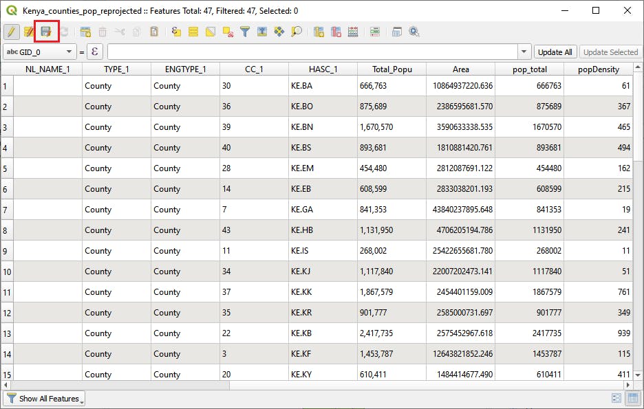
Remember to save the edits done on the layer by clicking the Save button highlighted below.
d. Style the data
To create the map, we have to style the population density data and present it in a form that is visually informative.
To start on styling the data:
Steps:
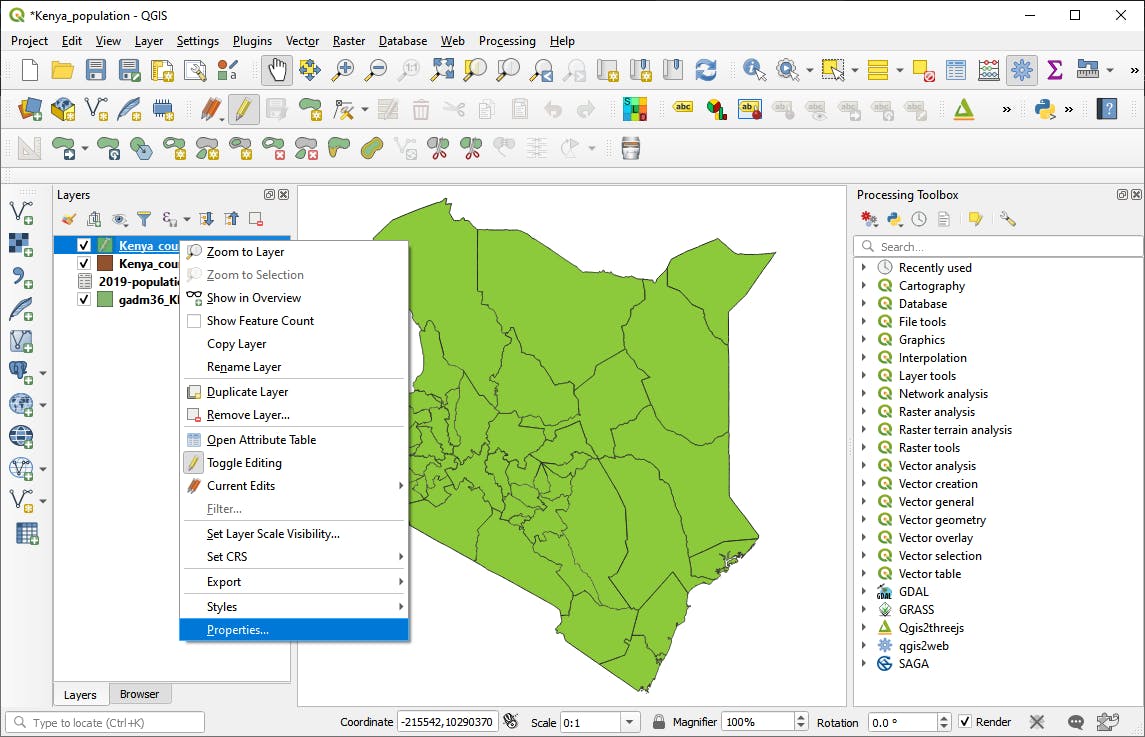
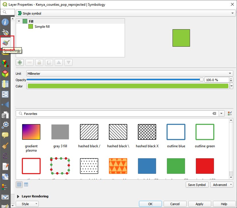
a). Open the properties window
b). Open the symbology tab
c). Choose the Graduated Symbology method in the first drop down.
d). For the column section select popDensity column.
e). In the Legend Format section choose precision to be 0.
f). Choose a suitable color ramp. For my case I chose reds.
g). In the mode section, choose Quantile (equal count).
h). In the classes put 5 classes.
i). Click classify. Then check if the classes have been formed as expected.
j). Then click on apply to apply the symbology.
k). Then click ok to close the properties window.
The above steps are shown below:
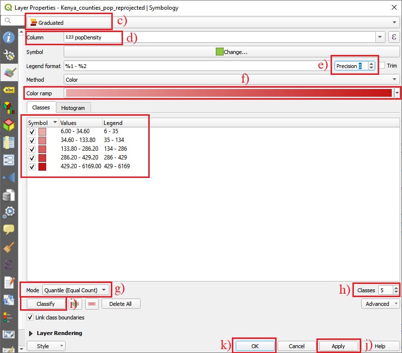
We used the Graduated symbology method because it is used to show the quantitative difference in feature values with a range of colors. Since we used 5 classes, 5 different colors are assigned to each class.
Note: Normally when choosing the number of classes one should not choose more than 7 classes because beyond this, the human brain cannnot comprehend them
This is how our styled layer looks like:
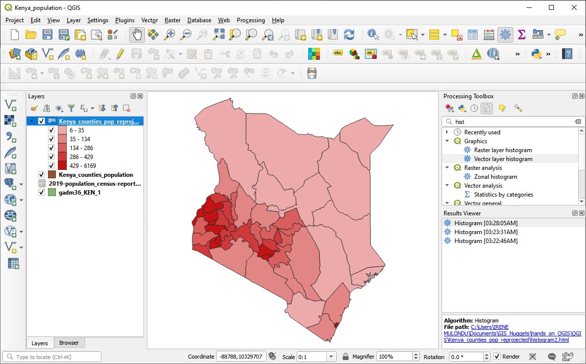
Woow! This is just beautiful.
So from the styled layer we can be able to see how the population density varies in the counties and with the legend we can be able to interpret the results.
We have been able to do some GIS Analysis, where we have chosen some analysis tools and then perfomed the analysis using the tools chosen.
However, our desired final map output is a pdf map highlighting how the population varies in the Kenya counties and it should be easy for someone else to follow. This is done in the last steps of the GIS Method, Examine and refine results. So stay tuned for that final part because we will look deeper into the results we have obtained and then compose our map.
Remember, if there is anything you would need clarification, feel free share in the comment section.